Search This Blog

Monday 8 April 2013

Sketchbook Review: Veneq's epic journey of self discovery

Artist: Veneq
Sketchbook Name: Veneq's epic journey of self discovery
Link: http://cghub.com/forum/showthread.php?t=10103&page=5
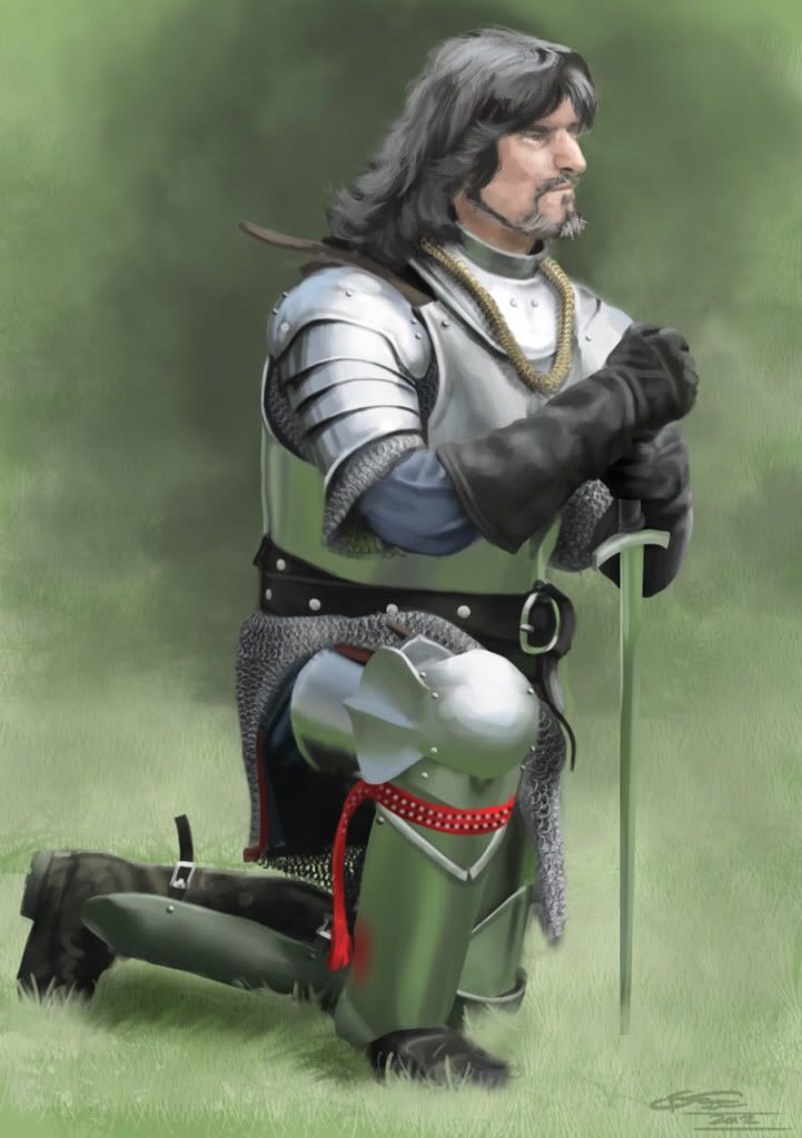
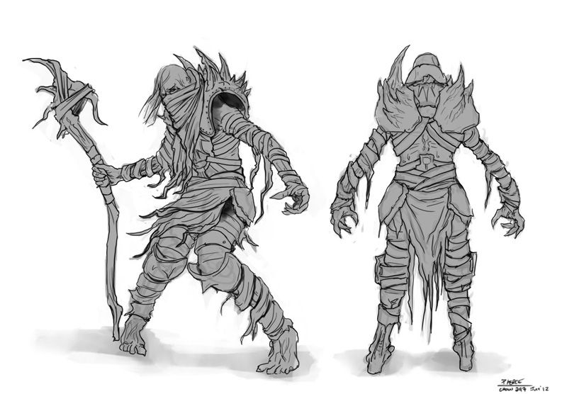
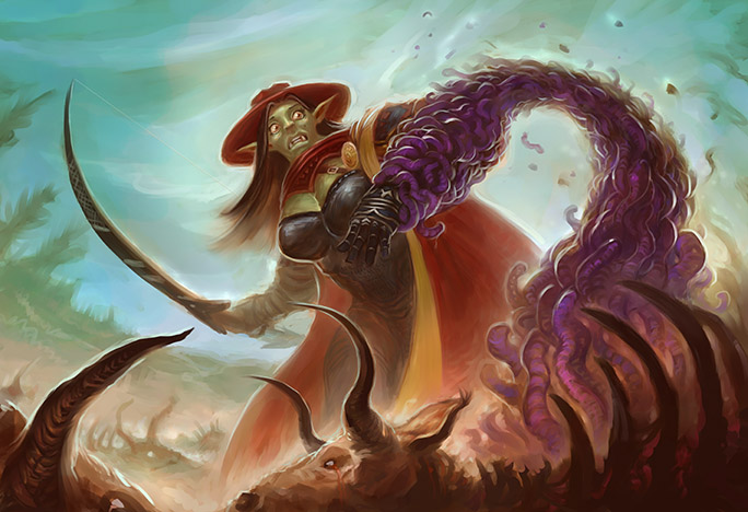
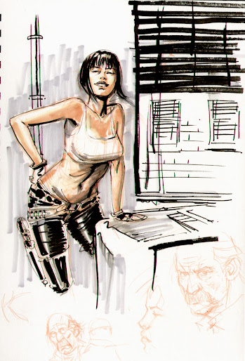
Artwork


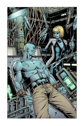
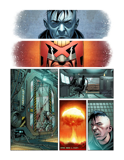
Holy crap. I go searching for sketchbooks to feature and this one comes along. From start to finish this is a fantastic portfolio. There is enough different styles to keep even me entertained. Not only that but each style is expertly and confidently handled. Nearly every piece is rendered to near perfection and the backgrounds to some of the images, just wow.

Growth


Whilst the start of this sketchbook is good, it does feel a bit flat in places. Fortunately this is corrected very quickly. It does seem like Veneq is constantly pushing himself but he has reached a level where there is not much more he can grow. Perhaps experimenting in new styles like cell shaded but that is really nit picking.


Presentation


This is where I struggled to find something. There were that many pieces I could have shown that the only real way to do this sketchbook justice is to recommend you check it out yourself. The concept pieces especially are presented fantastically making full use of the sketchbook layout. That little bit of extra effort has really paid off as it shows off his skill perfectly.

Interaction


As well as being an expert artist Veneq is very polite and will always respond to each post. He comes off as a really nice guy and that is another one of this sketchbooks strengths. I cannot emphasise how much of a difference this makes to me when writing these reviews up. He come across as a man I would love to work with.

Other Points


Nothing more really to point out here. Perhaps just continue as you are as I would love to see more work from you.

Score 10/10

You know what I am feeling in a generous mood and I can only find one fault with this sketchbook, so Veneq, you are getting my first perfect score.

+ Great presentation
+ Some growth from the start
+ fantastic work in general

- I want more

Sunday 7 April 2013

Okami Official Complete Works: Sponsored Post

Click the image to buy
For those of you who have played Okami you will probably be really excited about this complete works book. Okami had fantastic art direction and won critical acclaim. The game may not have been a commercial success on its release but it holds a special place in the hearts of many gamers.


The game was heavily inspired by Japanese water colour paintings and wood carving art. The book itself is full of beautiful illustrations and stunning concept art. This is a must have for all those who love art.

Order your copy from the link bellow or brows our range of game art books http://astore.amazon.co.uk/artfreck-21?node=34&page=1


Friday 5 April 2013

Sketchbook Review: The Aether Technician's Sketchbook

Sketchbook Name: The Aether Technician's Sketchbook
Artist: Aether Technician
Link: http://www.conceptart.org/showthread.php?t=250599&page=6#.UV2-THBwZwZ

Art Work


I really like this sketchbook. From post to post, you have no idea what will come next. I have seen 3D models, quick sketches, concepts, and even some sculpture work. One thing I will warn you about is the start is extremely rough. This is more from in experience than anything else.

Growth


In just a few months Aether has transformed so much. In the beginning his work, in all honesty, was not that good, but through hard work and determination Aether seems to be developing an interesting style. This is extremely early days at the moment but there is a lot of potential in his work.

There are a few areas that need addressing first. There are times when his colours appear a bit muddy, but this is a relatively new sketchbook and with the rate he is growing these issues should be sorted out in no time.

Presentation


I am going to give massive points for this. Not only is his concept art presented in a very neat manner but he has also done something really rare in sketchbooks, animated images. These simple animations really bring the image to life and I would love to see more artists do this. The forever waiting image on page 5 gave me a chuckle.

Interaction

Here is where the sketchbook falls slightly. I would love to see better audience interaction. I am not sure if he comments on other peoples sketchbooks but I am not a huge fan of 1 word responses. At very least mention their name. That said at least he acknowledges the comment rather than just post his next work.

Other Points

This is a fairly short sketchbook at the moment, with only 6 pages so far. But it is one of the most exciting ones I have seen. Unfortunately it is too small to gain the really high marks, that said I will probably re-review this at a later date.

I sincerely hope Aether does not lose his experimental curiosity as this will make his work stand out from other sketchbooks. Keep trying new things, don't be afraid to fail.

Score 6/10

+ Every post feels fresh and exciting
+ Interesting pieces
+ Great presentation style
+ Animated images

- Very short at the moment
- Little interaction
- Muddy colours in some areas

Featured Artist: Solomon Russell

I originally knew Solomon from my time on the IFX forums. Nice person so it is nice to be able to feature his work on this blog.

Be sure to check out his full portfolio over at http://solomon-russell.deviantart.com/gallery/


I love Solomons distinctive cartoony style. When he gets it right it looks fantastic and charming.


One piece of advice I would like to give to Solomon is to look back at artists that inspired him to see what he can learn from them.


Thursday 4 April 2013

Sketchbook Review: NorthernChild Sketchbook

I am going to try something a little different with this review. A new format. If it works out well then all future sketchbook review will be done in this format.

So what is new?

Well we will be reviewing the sketchbook. Not just looking at the art but also interaction with commenter, presentation of the images, and is the artist pushing them self.
Another new feature will be the rating system, complete with summery, so without further delay lets look at today's sketchbook

Sketchbook Name: NorthernChild Sketchbook
Artist: NorthernChild
Link: http://cghub.com/forum/showthread.php?t=1338

Art Work


NorthernChild's sketchbook looks great. The work is at a consistent quality level. There is also a good variety of work. One minute Child could be working on a fully rendered finished piece, the next could be a sketch or 3D work. This prevents the sketchbook from getting too stale.

Growth


Not too much can be said here. NorthernChild has been pretty consistent. One thing I have noticed is that NorthernChild has got more daring with lighting techniques compared with the start of the sketchbook. I would like to see more interesting perspectives in future updates.


Presentation


The presentation of some of her image sets looks really nice. This is really oblivious with the 3D projects. Rather than just post one image after another in a vertical column, some time is given to just make sure the layout is not only readable but aesthetically pleasing.

Another thing is some of the 2D works have nice frames around them. This not only looks nice but makes the images stand out that bit more.


Interaction


NorthernChild always makes an effort to interact with anyone who comments on her sketchbook. If she has no images to show off she will write something anyway. I really enjoy this about any sketchbook. It shows that an artist is not too busy for their fans.


Other Points


Whilst this is what I would consider a high end sketchbook I do kind of miss quick studies. I appreciate that this may not be the direction that NorthernChild wants to go down but I personally always enjoy a few rough pieces or even something a bit silly on occasions.

That said this is a very good sketchbook, and one I am looking forward to see grow.


Score: 8/10


+ Good variety of work
+ Very skilled execution
+ Lots to view (over 23 pages)

- Could do with some interesting perspective pieces
- Would love to see more studies and environments

Tuesday 2 April 2013

Featured Artist: Scott Purdy

If I had to describe Scott's work in one word it would be "disturbed". It is almost as if he has the ability to reach inside your mind and pull out some of you deepest fears, and like the masochist I am, I loved every single image in his portfolio.


Scott has worked on some impressive projects. One of the best known and instantly recognisable is the Dr Who card game. After looking at that part of his portfolio I can tell you He was most certainly the perfect choice for that project. I never realised how creepy the monsters were in Dr Who but Scott has ensured I will not be watching that show before bed any time soon.


Scott Purdy is also a published author. He has two books that can be purchased.


Draw and paint fantasy art - Vampires, teaches you how to draw vampires. Ten extremely gradual step-by-step projects show how to conceptualize, draw and paint a great selection of vampire characters. Projects include all vampire classics? from the legendary Dracula to modern pop-culture icons such as a Goth Vampire and a High School Cheerleader vampire. The first part of the book provides general guidelines on basic concepts and techniques, and vampire lore. Click here for prices. Draw & Paint Fantasy Art - Vampires (Draw and Paint Fantasy Art)


Goblinoids teaches you how to create goblins and goblin like creatures. This fun fantasy art instruction book explores the previously unchartered territory of Goblinoids. Artists of all skill levels will learn how to design, draw and paint every kind of goblin type of creature. This fun exploration of all six goblinoid races of the fantasy world offers a highly practical, step-by-step approach to creating a wide range of characters from the humorous, quirky and cute through to the dark, evil and twisted. Click here for prices for Goblinoids

It seems only natural that Scott Purdy would be into zombies. There is an entire page on his site dedicated to the subject. Naturally this would have some pretty gruesome stuff. That said, wow, the detail in some of these images really shows off not only Scott's talent but also his passion for zombies.

Remember you can view his portfolio on his site http://www.scottpurdy.net and on Deviant art http://scottpurdy.deviantart.com/

You can also follow him on Twitter https://twitter.com/scottpurdy


Art Of God Of War 3 - Sponsored Post


This book is a must have for any aspiring concept artist. 272 pages of pre and post production work behind one of the best loved video game franchises of this generation. 

3D models, character studies, story boards, there is something for all art lovers.

If you are looking to break into the video games industry this book is useful in the way that you can see what level you need to be at and the sort of art you should put your portfolio.


What makes art of god of war 3 so special?


The god of war franchise is famous for it's over the top action and gorgeous set pieces. Kratos himself is iconic.

As well as having concept art, 3D models, storyboards, etc, you also get some words from the artists who worked on the game. The go through their thought processes and much more.

If you have not had the chance to play any god of war, here is a taster of the game.


If this clip interests you even just a little I would recommend getting the art book.

Click here for prices. The Art of God of War III (Art of the Game)
Also available in our online store http://astore.amazon.co.uk/artfreck-21/detail/1921002727

Don't forget that we have an expanind selection of game art books in our online store. http://astore.amazon.co.uk/artfreck-21?_encoding=UTF8&node=34

Friday 29 March 2013

Imagine FX issue 95 review: Manga Issue


I've seen enough hentai to know where this is going (sorry it had to be said).  This is the reason I am still subscribed to IFX. Being a huge fan of the manga style how does this issue stack up to my expectations? The front cover is a stunning 2 page spread (over the front and back cover). Derrick Chew has really out done himself here.

Let me just say, if you are expecting nothing but manga art in this issue, you maybe disappointed. FXPose is kind of lacking in this area. That is not to say that there is no talent there. It is the usual impressive gallery that is has always been and it serves as a bit of a break for those who are not necessarily into this style. My favourite artist in this section this month is Leann and Karin Regenass (page 17). This is a delightful and unique find.

Tutorials

First off the artist's Q&A seems less intimidating than previous issues. I think this is because manga art seems more accessible than the usual photo realism illustrations that artists want to emulate. This whole section has a fun feel to it and on a personal level makes me want to dust off my Wacom and get stuck in.

For those of you who want a more advance tutorial, the later pages should peak your interest. These will be a little more intimidating for the more casual artist but they are very informative. I personally love the simplistic image on page 77. Choi Won-Chun teaches how to take full advantage of photoshop's masks feature.

Other Noteable Sections

The sketchbook section features some unashamedly stylised works. The confidence here shows some real potential. Whilst not at the same level as most of the other images in the magazine there is alot of heart here and that brought me an unexpected smile.

Artist portfolio seems a little out of place in a manga issue. Don't get me wrong Simone Bianchi is an extremely talented comic artist with a very impresive portfolio but could they not have found a manga artist. Why not feature Genzoman? I would have loved to hear more from him.

Overall Impression

Being a huge fan of the manga style I felt this issue was fun but I do feel that there were afew missed opportunities. I was half expecting wall to wall manga/ anime but some areas where lacking. Is this issue worth getting? Yes. No matter what level of artist you are, you will find something you will enjoy. Even if you don't like manga there are enough breaks for you to enjoy. Part of me wishes they had of stayed on topic though and I do wish they tackeled manga more throughout the year.

Wednesday 27 March 2013

Artist Feature: Dylan Teague

Holy crap this guy is good. Dylan's sketch blog makes you want to pick up a pencil and draw. This blog is filled with some fantastic sketches and some awe inspiring comic pages. The great thing about this blog are the development of some of the final pieces. You get to see Dylan's work process, something that I personally love.

Visit his blog at: http://dylansdrawingboard.blogspot.co.uk/


I have not seen a sketchbook use colours quite like Dylan's The varying shades of red and blue are a great contrast and I would love to see more artists post work like this up. The image above seems a bit chaotic and eclectic but for some reason I can't stop starting at it, and this is just one example of his sketches.


I always try to feature the female form in this blog (feel free to call me a pervert) and these studies are a fantastic example of how to lay out your sketchbook. Rough doodles in light blue fill up otherwise unused space whilst not detracting attention from the main figures. Line quality is superb and eye catching. No line is out of place or wasted.


I know a few artists struggle with colour (myself included). This is a fine example of how to apply colour. By using minimal tonal variations Dylan has brought this character to life. The minimal background and foreground look fantastic and really bring the piece together.

I love featuring comic work. I feel it takes a great amount of knowledge and effort to even attempt comic art yet alone master it. This is where Dylan really shines. His professional level and expertise is outstanding. This part of his portfolio is worth a visit on its own.

I could easily ramble about Dylan's work all day but I would recommend you view it for yourself. http://dylansdrawingboard.blogspot.co.uk/

Tuesday 26 March 2013

Artist Feature: Petitecream

I was alerted to Petitecream's work via my twitter feed. She was promoting her comic "The Wastelands" I was impressed with what I saw so I felt the need to show Petite's work to you.

To view all her current projects visit http://www.petitecreme.com

Before I get onto the comic lets look at some of the other interesting works in her gallery.

Some of her more graphical styles look really cool and eye catching. There are some good colour schemes going on in Petitiecream's work.


Another thing I love is the use of texture. When done right this adds an extra element to the atmosphere of an image. The marbled effect combine with the subtle dark tones in the image bellow give a creepy foreboding feel.


Anther image of Petitecream's that makes excellent use of texture is the bellow environment study.


The sketches from her TF2 Halloween series are eye catching in their minimalist nature. These are a unique take on a very popular game and I would love to see more work in this style.


Now on to the comic. Whilst Petitecream has a few comics under her belt that are worth a look, the Wastelands just has a much stronger look to it. The first few sample pages on her site look fantastic. All that she has learnt from all the images she has displayed over the site seem to have merged into a fantastic style. The environments are fantastically textured making them leap off the page and the bold daring use of lighting creates a final product that is difficult to ignore.


Overall whilst Petitecream as a bit of a way to go this site is certainly worth a visit. This is one artist that will be a joy to watch grow. http://www.petitecreme.com

Tuesday 19 March 2013

Featured Artsit: Mel Artugue

I am over joyed that I get to feature a vector artist. Mel has a great range of works from unique looking vector portraits, right the way to avatars. I really don't get to see much vector art so when one comes along you can bet I am going to feature it.

View Mel's blog over at http://www.melartugue.com


It is something most of us never think about but someone created the default avatars you see on forums and comment boxes. Mel has given me a new appreciation to these little works of art. These designs are very well executed and look great as a set.


The above image is my favourite in Mel's gallery. The vector style looks very distinctive and eye catching. I love the 3D look to this style.


Being somewhat of an anime and manga fan, another thing that I love about Mel's portfolio is the cartoony images. The graphical nature of these can have a multitude of applications and I would love to see Mel get lots of commissions in this style to expand his portfolio.  Be sure to request a commission from Mel via his website http://www.melartugue.com/p/contact.html


One of Mel's more recent work is for an up and coming game project. I love the range of characters in this and I love the style.

Over all I cant wait to see this artist grow and produce even more great and unique pieces of art. Be sure to check out Mel's full portfolio http://www.melartugue.com/


Sunday 17 March 2013

Sketchbook Feature: Inward outward! i want to draw


Sketchbook Name: Inward outward! I want to draw
Artsit: GrayPersona
Link: http://www.conceptart.org/showthread.php?t=264250&page=4

Whilst this is a small sketchbook at the moment, it is no less deserving of a look. The improvement GrayPersona has made is impressive.


There are alot of nice studies. From Bridgeman to Loomis this artist is off to a great start. Gray also has a good grasp of values which I know from personal experience is a tricky subject.


If there is one small complaint I have about the sketchbook it is with the lack of imaginative pieces. GrayPersona has the skill to produce impressive finished pieces but I feel Gray lacks the confidence. I cant wait to see some coloured personal pieces. I am sure they will look amazing.


My personal favourite piece is the jug study. The values are fantastic and the metal is rendered very well. I cant wait to see this artist grow.